 elixxier – Photo Blog Light settings and lighting structures for studio and outdoor photography. Tips and tricks for set.a.light 3D – The photo studio and light simulation for photographers.
Let’s start very easy:
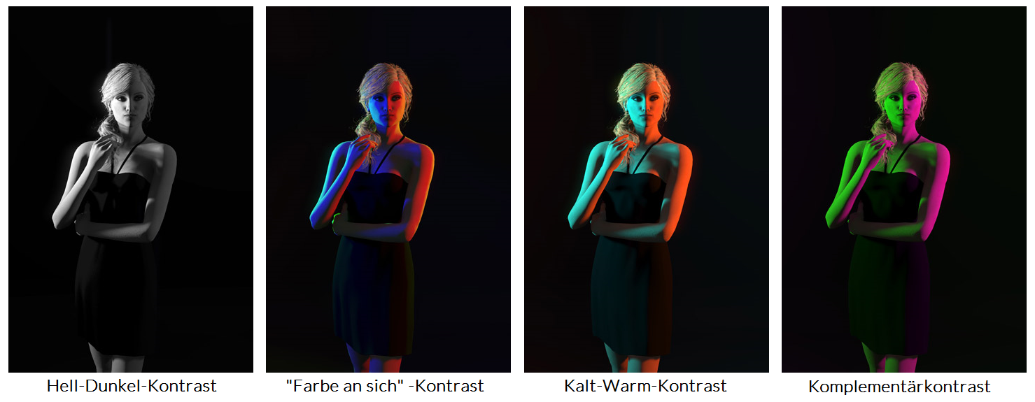
Color contrasts are the differences between colors, which distinguish them from each other.
 Contrasts help you generate tension in your images. You can emphasize specific areas or take away the attention from them. According to the theory of light, there are seven color contrasts in nature, which you can also use in photography.
Those are the ones that we are going to talk about now:
- Light-Dark-Contrast
- “Color itself” Contrast
- Cold–Warm Contrast
- Complementary-Contrast
– near / far (due to tiny particles in the air which affect the light refraction distances look bluish)
– calming / exciting
– wet / dry
– shaded / sunny
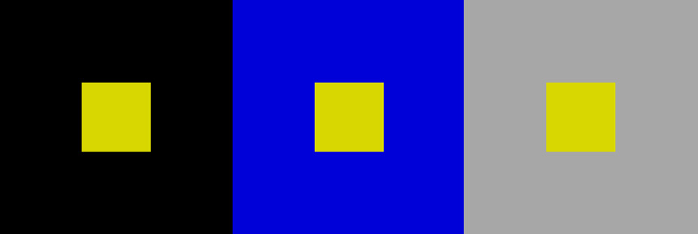
Simultaneous Contrast

The easiest way to describe this contrast is the following example:
Imagine a red area, and place a small gray square in the middle of it. The square is now not going to look gray, furthermore it is going to appear slightly cyan. The reason of this phenomenon is that two complementary colors always produce a neutral gray and our brain tries to examine this harmony. If this harmony is not present, the brain is irritated and tries to restore the harmony where it assumes that it should be. The same principle also works for non-colors. Here the brain adjusts the brightness. Now bright areas on dark areas appear darker than they actually are, and vice versa.
Quality contrast
This contrast is created by juxtapose saturated and murky colors. A color is murky when it is mixed with equal amounts of white and black. It is brighter and colder in mixture with pure white and is rapidly becoming a non-color when mixed with black.
This may sound negative, but helps to create an emphasis and accents, if you turn around the process: A not-too-bright color always seems stronger than it is in a gray or desaturated environment. Those who can remember the movie “Schindler’s List” will surely remember the red elements in this film.
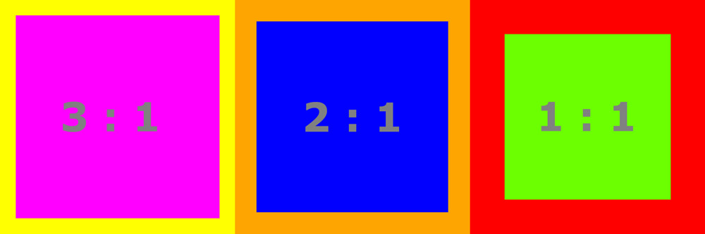
Quantity contrast
The last contrast deals with the areal distribution of two different colors. If their brightness and their surface are nearly the same size they appear harmonious. But if you change one of the values, you will get a tension between the colors and the picture.
For example, you need a ratio of 2 : 1 if blue and orange should appear harmonious. That means you need twice as much of blue surface because orange is twice as strong as blue.
The best thing to do is to try out all of those contrasts in set.a.light 3D and you will see how much you can do and how easy you’ ll be able to take a huge influence on your pictures if you work with color contrasts :)
Quick Links…
–> set.a.light 3D
–> Facebook
–> Instagram
This post is also available in: German